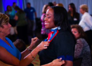
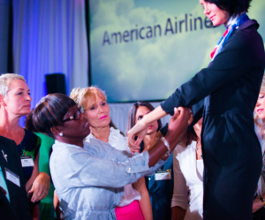
Last December, American Airlines released their prototype of the new uniform for their employees. The feedback AA got on the uniform appeared to be mostly on the negative side, as employees weighed in on fit, style and functionality.
I commented on my first impressions of the uniform I saw on a flight out of JFK, and to be honest, I wasn’t impressed.
- From an aesthetic standpoint, it appears a bit more dressy than the current style. The vest he was wearing was something I would wear to a wedding.
- The new style appeared to be more form fitting and “tight,” though perhaps this specific individual requested a slimmer size. As the FA stowed a passenger’s bag, you could tell a portion of the shirt was yearning to be untucked.
- The uniform lacks any color, which makes it look very drab when walking down the aisle.
- The pants appear to be of a lighter material – and tend to flex like golf pants which are not made of a stiff material.
Well, looks like the feedback has led to a major re-design – and it’s finally out for the second wear test.
Via the August AA monthly employee newsletter:
In April, the uniform committees provided feedback on wings, name bars, and crest designs. Today, they saw prototypes and we are now finalizing the designs. The next step: another round of real world testing. Starting Sep. 28, more than 80 pilots, flight attendants, Premium Customer Services representatives and airport customer service agents will don the prototypes for the wear test. During the four-week test, participants will share their feedback on the uniform’s durability, comfort, fit and function so we’re sure it stands up to the wear and tear of working conditions.
While full details haven’t been released on the uniforms, there’s several things I note in looking at the pictures and reading into the release:
- The uniforms take a more “legacy” AA approach. Just looking at the uniform examples, you’ll see closer resemblance to the now-current uniform than you will of a newer style.
- There’s more color. One of the biggest complaints of the first re-design prototype was the lack of color. They seemed to have changed that with the men’s tie and women’s scare. The colors match the American flag, and AA’s logo.
- The uniforms still follow a more trimmed look, though keep the legacy feel to them, which I think is important. AA had wanted to keep aspects of their heritage in the new uniform, and I think they’re on the right track here.
- There appears to be a “wrap-dress” for the females – not sure if this is specific to flight attendants or airport staff, but to be honest, I’m not a fan of this one. It’s more of a casual look, and leans more to the US Airways-house side of things, so my vote is “no” on this one.
- I don’t like the stripe on the sleeve, since it closely resembles United. If it were my vote, I’d go to the current gold version.
I’ll be interested to see the findings of this second round of testing.
What do you think of the new American Airlines uniforms?


 Jamie Larounis is an avid traveler, blogger and miles/points educator. Traveling well over 100,000 miles a year and staying in hotels for over 100 nights, he leverages miles, points and other deals to fly in first class cabins, and stay in 5-star hotels. The Forward Cabin shares his experiences, musings, reviews, tips, tricks, resources and industry news with you, the fellow traveler.
[…] http://theforwardcabin.boardingarea….rm-prototype/# Thought some people may be interesting in seeing actual, new Twin Hill uniforms. They are boring and look exactly like my current LUS uniform. […]