
In an effort to improve the visual look of the monitors at each boarding gate, American has redesigned the gate information display systems.
The welcome screen has the city in a bolder font and more noticeable.

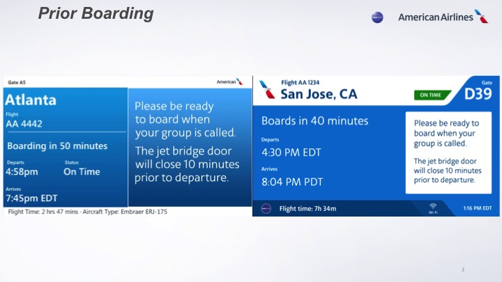
Prior to boarding, the city name is more noticeable, as well as the gate number.
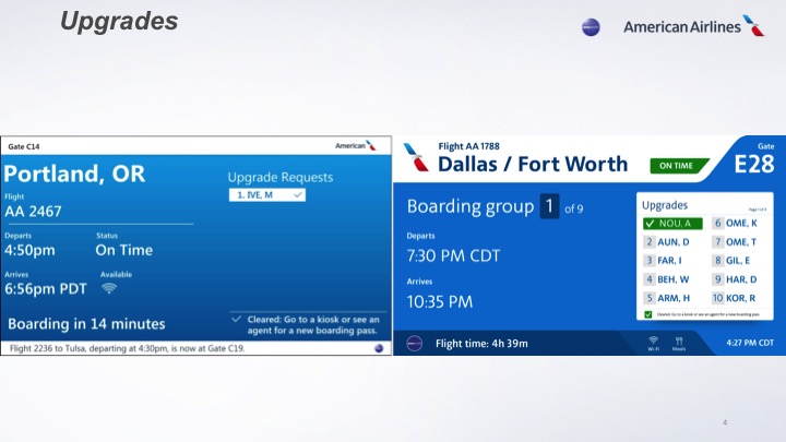
This screen I love. The boarding number is FAR more noticeable and will hopefully keep those in lower group numbers away from the gate area.

On the upgrade screen, it’s more noticable as to which upgrade has cleared, though I believe it will now list less names per upgrade screen (which, in the end, is probably fine since it’s rare that more than 10 upgrades are cleared per flight).
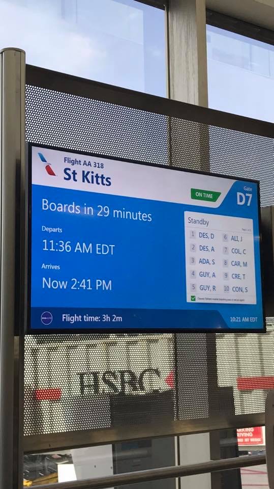
Here’s a live look from a gate in Miami.
I’ve been told there are no functional changes to the displays… everything is visual.

 Jamie Larounis is an avid traveler, blogger and miles/points educator. Traveling well over 100,000 miles a year and staying in hotels for over 100 nights, he leverages miles, points and other deals to fly in first class cabins, and stay in 5-star hotels. The Forward Cabin shares his experiences, musings, reviews, tips, tricks, resources and industry news with you, the fellow traveler.
How did you get these information? From AA official website or others?