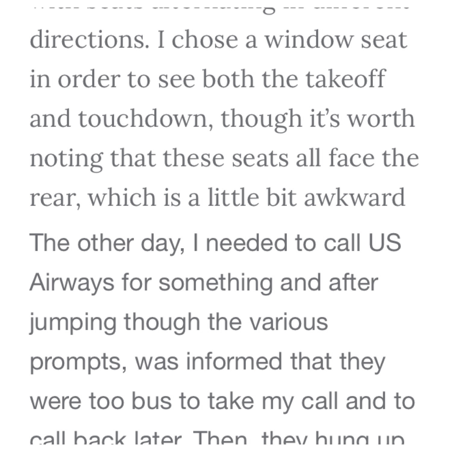
I’m debating on changing the font on the blog to something a bit more modern, and in-line with similar blogs with high readership (surprisingly, a font affects how many folks are willing to read, since the eye is attracted to certain fonts over others).
I need your opinion. Here are the two choices in the image below. Which do you prefer?

Tell me your vote in this poll and I’ll choose one reader to win a complimentary GoGo inflight wifi session for helping to voice your opinion!
[yop_poll id=”2″]


 Jamie Larounis is an avid traveler, blogger and miles/points educator. Traveling well over 100,000 miles a year and staying in hotels for over 100 nights, he leverages miles, points and other deals to fly in first class cabins, and stay in 5-star hotels. The Forward Cabin shares his experiences, musings, reviews, tips, tricks, resources and industry news with you, the fellow traveler.
A serif is for business documents and official filings. Go with the bottom.
I would go with the bottom as well.
For accessibility purposes, sans serif (bottom) is the responsible way to go. ADA requires sans serif for signage, and it is good practice elsewhere as well.